Evil Pies
http://www.datavis.ca/gallery/evil-pies.php
Diagram, Interesting, Stimulus
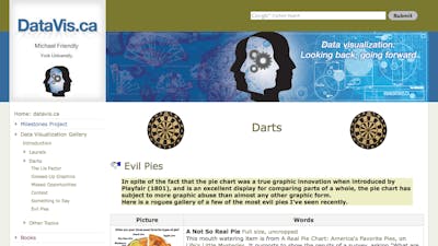
In spite of the fact that the pie chart was a true graphic innovation when introduced by Playfair (1801), and is an excellent display for comparing parts of a whole, the pie chart has subject to more graphic abuse than almost any other graphic form.
Here is a rogues gallery of a few of the most evil pies I've seen recently.
Michael Friendly
3 March 2013 Edit: 25 February 2014
- Topics:
- Data, Sector Graphs (Pie Charts)
- Content Type:
- Diagram, Interesting, Stimulus
- NSW Mathematics K-10 Syllabus
- Statistics and Probability, MA4-19SP Data Collection and Representation
Submit a correction to this link | Help align this link to The Australian Curriculum
Comments
How have you used this link in your classroom? Share your teaching ideas or leave a review about this link.
Sign in to leave a comment.
There are no comments for this link.