Fox News bar chart gets it wrong
http://flowingdata.com/2014/04/04/fox-news-bar-chart-gets-it-wrong/
Image, Publisher, Flowing Data
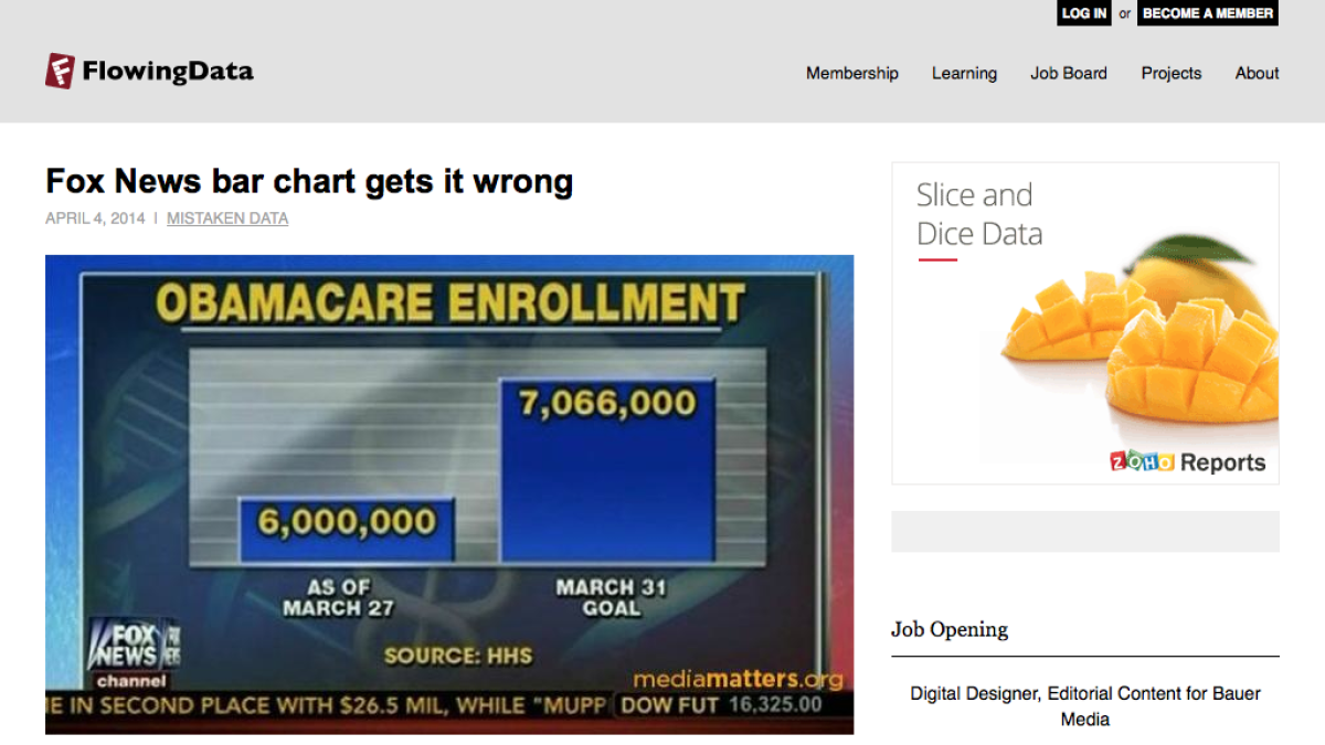
Fox News continues to be a great source of misleading graphs.
This time a column graph with no scale, a displaced y-axis.
5 April 2014 Edit: 29 April 2017
- Topics:
- Data, Misleading Graphs
- Content Type:
- Image, Publisher, Flowing Data
Submit a correction to this link | Help align this link to NSW Mathematics Syllabuses align this link to The Australian Curriculum
Comments
How have you used this link in your classroom? Share your teaching ideas or leave a review about this link.
Sign in to leave a comment.
There are no comments for this link.