Fox News still makes awesome charts
http://flowingdata.com/2011/12/12/fox-news-still-makes-awesome-charts/
Image, Publisher, Flowing Data
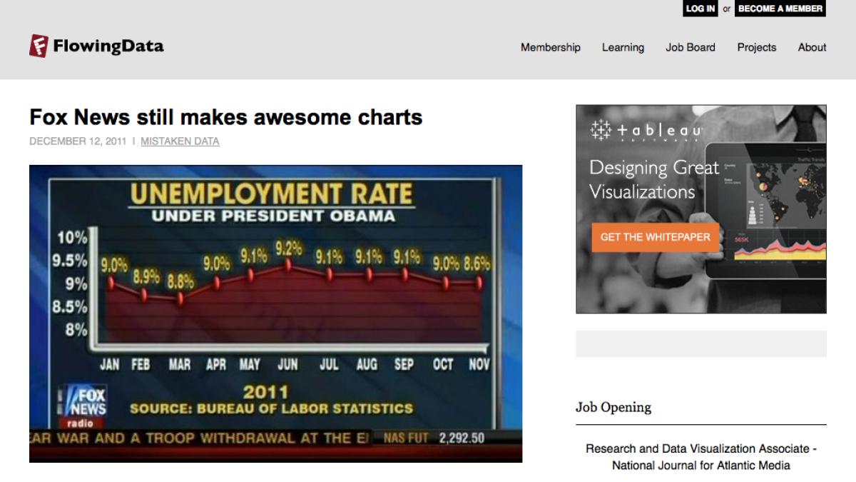
A chart from Fox News (US) where the data points have not been plotted correctly.
5 April 2014 Edit: 29 April 2017
- Topics:
- Data, Misleading Graphs
- Content Type:
- Image, Publisher, Flowing Data
Submit a correction to this link | Help align this link to NSW Mathematics Syllabuses align this link to The Australian Curriculum
Comments
How have you used this link in your classroom? Share your teaching ideas or leave a review about this link.
Sign in to leave a comment.
There are no comments for this link.