Counting the Hours
http://flowingdata.com/2015/11/10/counting-the-hours/
Infographic, Interactive, Interesting, Publisher, Flowing Data, Stimulus
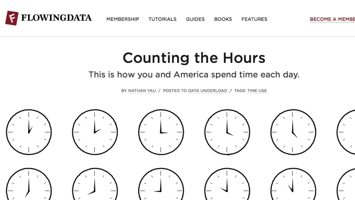
From data obtained by the American Time Use Survey, this site has created a series of graphs. The distributions of time use for various activities across the day are interesting. When talking about positive and negative skew, it's sometimes hard to find a 'real-life' example that students will relate to. However, this data capture skewed distributions from data students will be familiar with.
28 November 2015 Edit: 29 April 2017
- Topics:
- Data, Data Representation
- Content Type:
- Infographic, Interactive, Interesting, Publisher, Flowing Data, Stimulus
Submit a correction to this link | Help align this link to NSW Mathematics Syllabuses align this link to The Australian Curriculum
Comments
How have you used this link in your classroom? Share your teaching ideas or leave a review about this link.
Sign in to leave a comment.
There are no comments for this link.