Australian Trade & Industry Alliance Carbon Tax Ad
Video, Vimeo
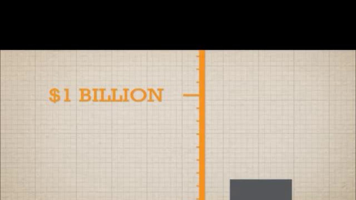
When looking at the topic of Data Representation with Stage 4 students, we cover “misleading graphs”. That is where the creator of the graph constructs the graph poorly to bias one viewpoint. (See the NSW BOS 7-10 Syllabus: “analyse graphical displays to recognise features that may cause a misleading interpretation eg displaced zero, irregular scales” DS4.1). In addition to the examples listed in the syllabus, I also talk about the misuse of area.
What are the two problems with the graph in the advertisement above?
How do these problems support (or not) the case being put forward in the advertisement?
It would be a simple exercise for students to create this graph correctly.
[Originally posted on MathsClass]
7 August 2012 Edit: 23 February 2014
- Topics:
- Data, Data Representation, Misleading Graphs
Submit a correction to this link | Help align this link to The Australian Curriculum
Comments
How have you used this link in your classroom? Share your teaching ideas or leave a review about this link.
Sign in to leave a comment.
There are no comments for this link.